LOA HEX brand
Brand assets
Logo, colours, type and voice for everyone working with the LOA HEX name — trade partners using our mark on their site, contractors designing collateral, press and media mentions. Help yourself.
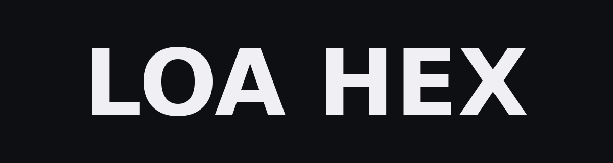
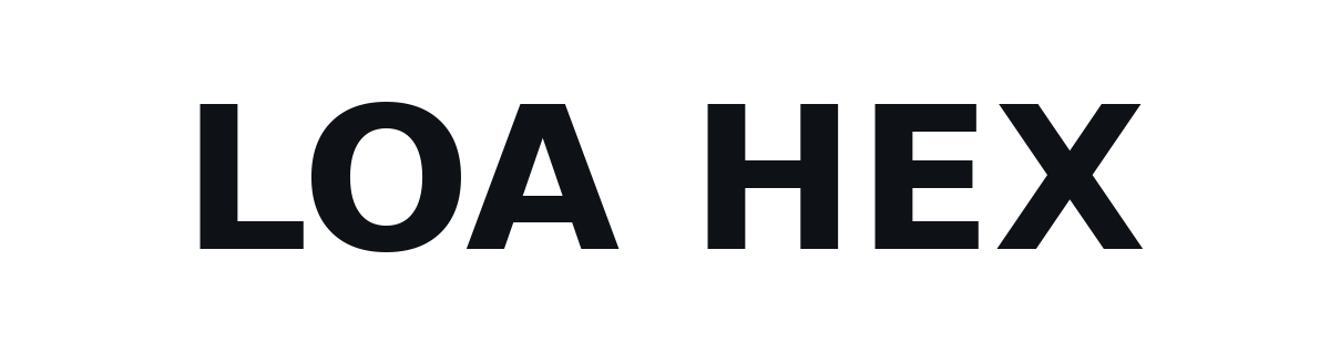
01 — Wordmark
Wordmark
Always set in Poppins Bold, all caps, with a single space between “LOA” and “HEX”. Don’t typeset it yourself — use one of the SVGs below so the spacing and case stay correct.
02 — Brand mark
Brand mark
The hex tile with a veve crossroads inside. The crossroads echoes the loa — the spirit you meet at the junction — without naming it. Three sizes covering hero placement, app-icon, and favicon.
03 — Colour
Colour palette
The accent does the heavy lifting; the inks and backgrounds form a quiet ladder behind it. Don’t introduce new colours without a conversation.
Primary accent. Used for the mark, CTAs, focus states.
Hover + pressed states for the accent.
Primary text on dark backgrounds.
Secondary text — captions, descriptions.
Tertiary text — timestamps, disabled states.
Page background. Almost-black, never pure black.
Slight lift — cards, panels, sticky headers.
04 — Typography
Typography
Poppins Bold for headings, Lato for body, DejaVu Sans Mono for technical text (file IDs, SHAs, code). The site itself uses Inter as a close substitute when Poppins isn’t loaded; the brand specimen below shows the intended typefaces.
Heading — Poppins Bold
48px
From 5 minutes.
Body — Lato
17px
Drop your ECU bin. Our bot analyses it, matches against a tested library, and auto-delivers your tuned file — typically under 5 minutes for known ECUs. Brand-new tunes are built by hand, usually under 30 minutes.
Technical — DejaVu Sans Mono
15px
job_a31f4e · ECU 0261S0E033 · stage_2 · sha 7b9c41…
05 — Voice & tone
Voice and tone
How LOA HEX writes.
We say what we do, not how special we are. A subscription auto-delivers your customer's tuned file from 5 minutes when it's a known ECU; brand-new tunes are built by hand, usually under 30 minutes. That's the whole pitch. Anything more elaborate either earns its keep or gets cut.
We avoid hyperbole. No “industry-leading”, no “revolutionary”, no “world-class”. If something is fast, we say how fast. If something is reliable, we point at the status page. The work makes the case.
UK-flavoured English — “tyre”, “colour”, “workshop”, “bin file”. We don't use jargon unless our customer would, and when we do we explain it once. Numbers get tabular figures so they line up.
The single tagline is “From 5 minutes. Tuned by people, not pipelines.” Protect it. Don't reword, don't paraphrase, don't split across lines unless the layout requires a break after “minutes.” The honest qualifier “from” stays — it covers the auto-deliver path while leaving room for brand-new tunes that take a hand-build.
06 — Usage
Usage rules
The short version: leave the mark alone, give it room to breathe, place it on backgrounds it can be seen on.
Use the mark on dark or near-black backgrounds
The hex outline and crossroads are tuned for #0E0F12 and surfaces within ~10% luminance of it.
Maintain at least 12px of clear space
Measured from the outermost point of the hex. Other elements — type, photos, edges — stay outside that ring.
Use the SVG wherever you can
It scales without loss and stays crisp on retina. PNG is for places that don't render SVG (older email clients, some doc tools).
Don't recolour the mark
The accent is #FF6B1A. Don't tint, gradient, or replace it with a brand partner's colour.
Don't squish or stretch the wordmark
Letter-spacing and weight are part of the mark. Resize proportionally; never warp.
Don't place on busy or low-contrast backgrounds
If you can't read the wordmark from across the room, the background isn't right. Use the on-light variant or move the mark.